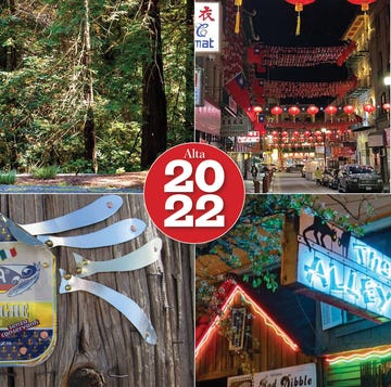
Writing nuanced pieces on everything from endangered species and murderers to Hollywood and a Judy Garland impersonator is not easy—and neither is illustrating these captivating stories. Every year, Alta Journal’s illustrators use different mediums to complement some of our biggest stories. To bring to a close this visually incredible year, we asked a handful of our contributing illustrators to share the aha moments, obstacles, and inspirations behind these breathtaking illustrations.
ZOE MATTHIESSEN, “BIRDS OF PASSAGE,” ISSUE 18
“I love birds and was intrigued when John Goecke asked me to envision the relocation of the endangered black-footed albatross. After reading the accompanying article, I watched a short documentary on similar rescue efforts, studied the Channel Islands’ terrain, and researched the black-foot’s nests and eggs. Ideas took shape as I studied and sketched. I pitched three concepts and to my delight was asked to go forward with not just one but two of them. Wonderful project!”
MARK SMITH, “SHE HAS A NAME,” ISSUE 18
“This story was fascinating and so well written; it was a joy to illustrate. A lot of my work is heavily influenced by cinema (compositions and viewpoints in particular take a lead from Hitchcock, among others), but with this job, I was able to find a way of weaving concepts into the more narrative-friendly, cinematic framework. It’s something I’ve been working toward for a while, and this story really helped me to find that balance I’ve been looking for.”
CHRIS SICKELS/RED NOSE STUDIO, “PLAY IT AS HE LAYS,” ISSUE 18
“Creative director John Goecke approached me with the essay, and we talked about how it could be approached. I generally lean toward lighthearted approaches to visual problem-solving, but in this case, we decided that we didn’t want to undermine the seriousness of some of the subject’s behavior. So we leaned into pushing the idea of excess and a fractured system of the awards. Aiming to uncover the layers behind the glitter.”
MATT MAHURIN, “WHAT SHALL WE DO IN OUR DARK?,” ISSUE 18
“When I began my illustration career 40 years ago, there was a thrilling freedom to create powerful work that didn’t pull any punches. Over the years, I’ve witnessed magazines becoming more and more timid in their ability to publish gutsy art. It’s reassuring to see Alta showing great respect for the art and artists they publish. Finally, working for John Goecke is a joy. Every time he calls with an assignment, I know I’m about to go on another amazing artistic adventure.”
STEVE CARROLL, “WHEN MARK TWAIN CANCELED BRET HARTE,” ISSUE 18
“To illustrate two writers of similar gravitas and who possess strong disagreements, I have drawn Twain and Harte in a sitting position, staring at each other. Their expression hints at a forthcoming argument.
Also, I enhanced their differences tonally. I found it useful to have Twain wearing his customary white jacket together with his shock of white hair. This contrasted well with the shadowed Chinese food store in the background. For Harte, it was the other way round: black jacket and black hair, surrounded by a light background.”
PHILIP BURKE, “THE MAN THAT GOT AWAY,” ISSUE 18
“John Goecke specifically commissioned me to create a painting of the female impersonator Jim Bailey that would show two faces/heads—one as himself and one as Judy Garland.
I had done a few paintings like this in the past and always enjoyed the surrealistic challenge in making the middle eye work equally well with both of the other eyes. In this one, I also enjoyed capturing the two distinct genders he embodied from the faces and hair to the hands, outfits, and body builds.”
VICTOR JUHASZ, “HE DREAMS ABOUT THE BUNNY RANCH,” ISSUE 18
“I read this story several times, and my takeaway was that this was a meditation on love and loss, particularly from the vantage point of the woman suffering with cancer. So I focused on her and her coming to grips with losing her looks and her sexual attractiveness, two attributes she holds very dear and self-defining, as well as very likely her life and the mate she loves. She’s confronting disappearance. She’s looking at the void.”
THOMAS EHRETSMANN, “‘THE WAYS OF FICTION ARE DEVIOUS INDEED,’” ISSUE 19
“I loved working on these two portraits! Obviously, I needed them to be intertwined somehow since the two writers now seem difficult to separate because of the plagiarism affair evoked in the article. So my task was to mix the portraits but also to show how we perceive these two people and their reputation. I wanted Mary Hallock Foote to look both innocent and threatened while Wallace Stegner’s image had to look stained. I tried to enhance this feeling by avoiding dark areas in the woman’s portrait.”
MICHAEL SCHWAB, “MADE IN CALIFORNIA” COVER, ISSUE 21
“When asked to create the cover art for the Made in California Issue, my first thought was—heroic portrait of a craftsman. A craftsman. But then the [creative] director, John Goecke, and I decided that we’d actually rather portray a female as our representative hero. I always start with Polaroids of models in my studio. Amita from diPietro Todd in Mill Valley was the perfect choice—a woman dedicated to her own craft and with the right physical attitude. Props: She needed an apron as a symbol of hands-on work plus a few little tools. For a bit of drama—the hammer. After scanning my ink drawings, we added a few dramatic colors. It worked!”


