Letterpress printing with hand-set type is a very physical process. Instead of laying ink down flat on the paper from an offset image, you’re pressing inked bits of metal into the paper, making an impression. Everything about this printing method is hands-on or mechanical.
It’s also a very dirty process, which is why printers wear aprons. Whether you’re printing directly from hand-set foundry type or from a polymer plate created from a digital file, there’s a lot of ink involved.
Some might even go so far as to call it a dangerous process. If you include hot-metal typesetting from a Linotype or Monotype machine, there may be scorching dollops of lead spitting about, too.
Traditionally, letterpress printing is done with foundry type—little chunks of metal with backward letters carved on their ends—which you can hold in your hand. This type is hand-set, which means placing each piece of type, one after the other, into a line of words held in a small metal frame—the composing stick—that you hold while you work; as you add more letters to the stick, it gets noticeably heavier. There’s nothing digital or virtual about any of this. The process of setting type by hand and then using it directly on a mechanical press dominated all printing until the arrival of photographic and then digital techniques in the 20th century.
Yet there are craftspeople, many of them young, who are still setting type by hand. In an age when the digital has overtaken the analog in so much of our lives, the hands-on process of letterpress printing has a clear appeal for anyone whose creative work is otherwise done in front of a screen. And some of these people are experimenting with combining letterpress and the digital world.
In the 1990s, from their “printing farm” in a river valley north of Seattle, Jules Remedios Faye and her partner, C. Christopher Stern, pushed the boundaries of letterpress printing, and through their practice and their teaching they influenced an entire generation of younger printers and bookmakers in the Pacific Northwest. The books of poetry that Stern and Faye made are still sought-after among bibliophiles and poets alike, both for the quality of their printing and for their often unusual designs; the anthology of work by female printers that Faye masterminded, The Ladies Printing Bee, is almost unobtainable today.
To the south, the great San Francisco printer Jack W. Stauffacher, at his Greenwood Press in North Beach, was a beacon of craft and culture for over 50 years, until his death in 2017. Stauffacher, who called himself simply Jack the printer, used to speak of having arrived at the end of a 500-year tradition. He reveled in the tactile world of ink, paper, and metal type, yet he also explored the new world of digital type, from his involvement in the seminal 1983 ATypI Working Seminar at Stanford, “The Computer and the Hand in Type Design,” to advising Adobe in the late 1980s and early 1990s as it strove to bring high quality to digital typography with the Adobe Originals type library.
In practical terms, today letterpress is more of a calling than a commercial industry. Letterpress printshops generally have a niche market: job printing of items like invitations, business cards, and coasters, where the tactile impression of metal letters pressed into paper or card stock makes the result a three-dimensional object. At the higher end, printeries like Arion Press in San Francisco make fine-edition books that sell for as much as $7,000 to collectors, libraries, and other institutions, while smaller shops specialize in printing books of poetry and poetic broadsides to feed their region’s cultural life. The San Francisco Center for the Book offers workshops to would-be printers, bookbinders, and makers of artists’ books; students can learn about the history of letterpress printing at the C.C. Stern Type Foundry in Portland or the International Printing Museum in Carson, south of downtown Los Angeles.
Letterpress printing takes place in small printshops and educational establishments up and down the West Coast. Here are some of the notable participants in this movement.
Peter Koch, Printers
Berkeley, California
Peter Rutledge Koch is both a master printer and an iconoclast. At his studio in Berkeley, and earlier in Oakland and San Francisco, he has been practicing the art of fine printing for almost 40 years, making beautiful and very expensive books much prized by collectors under the imprint Editions Koch. Although he was mentored by book designer Adrian Wilson and absorbed the traditions of California’s 20th-century printing culture, he brought to it an outsider sensibility.
Koch was raised in western Montana, 120 miles downstream from one of the largest open-pit copper mines in North America, the Berkeley Pit, now closed and designated a Superfund site. An awareness of the costs of industrial mining and other extractive industries lies behind Koch’s most ambitious project, EXTRACTION: Art on the Edge of the Abyss, which he began in 2018. The multiyear, multivenue, international undertaking aims to boost public awareness of how we’re treating the world as, in Koch’s words, a “sacrifice zone” out of shortsighted greed. The project’s launch video says that artists can “sound an alarm and break through the noise of modern media to make the gravity of our dilemma crystal clear.” EXTRACTION involves hundreds of artists, working in all mediums, on at least four continents, as they address the suicidal consumption of the planet’s natural resources.
Part of Koch’s own contribution to this effort is the limited-edition portfolio WORDS on the Edge, 26 hand-printed broadsides of poetry and lyric prose produced through a collaboration of writers and printers. Each printer interprets one of the texts, whose contributors include U.S. poet laureate Joy Harjo and Pulitzer Prize winner Forrest Gander.
One of Koch’s other major projects is the Codex Book Fair and Symposium, which he helped conceive. First held in 2007, it brings together fine printers, artists, librarians, and collectors every two years in Berkeley.
Partners in Print
Seattle, Washington
In 2001, Jenny Wilkson started the letterpress program at Seattle’s School of Visual Concepts after moving to Washington from Berkeley, where she had apprenticed with Peter Koch. Much the way that Koch created his own place in the bookmaking world, a forum for artists like him where one hadn’t existed, Wilkson formed a center and an incubator for the printing community in and around Seattle. For the next 19 years, SVC’s letterpress studio served as a central hub; most of the region’s practitioners taught there at one time or another, and the program’s students carry on the craft.
When the COVID-19 pandemic forced SVC to give up the space that housed the letterpress studio, the community rallied around as Wilkson and printer and teacher Amy E. Redmond devised a way to keep local hand-setting alive. The result is Partners in Print, a charitable organization that relies on engagement and collaboration. With the support of SVC, the pair formed a plan to move the heavy equipment and type cases to a number of individual printers’ workshops. The physical studio became a dispersed network, and the community cheerfully participated in online classes and projects like the Long-Distance Letterpress workshop series, a voter-mobilization initiative, and print exchanges. The mission statement of Partners in Print reads: “We bring people together by using old printing presses to amplify new voices, share knowledge, and spark creativity.”
SVC’s final public letterpress project—strategically named “Partners in Print”—was also PiP’s unofficial first: a series of crowdsourced posters for the 10th annual Seattle Design Festival last August. The festival’s theme? “About Time” and a shared hope of safely gathering people and presses under one roof again.
Ana Sofia Mariz
Seattle, Washington
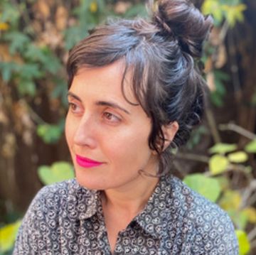
Ana Sofia Mariz, a Russian-Brazilian typographer and type designer (and former SVC letterpress student) living and working in Seattle, addresses the interface between analog and digital by designing new digital typefaces that are intended for letterpress printing. Her technique makes use of photopolymer plates: plastic printing plates made from digital files, which can be inked and printed on a mechanical press. The profound differences between what a digital typeface looks like on-screen and how it comes out when printed via letterpress on soft paper make this an exciting area to explore.
Echoing noted Berlin typographer-printer Erik Spiekermann, Mariz calls it post-digital letterpress printing. “I’m testing my assumptions about digital printing,” she says, “to see how different the appearance can be of the exact same digital font when printed on a high-quality laser printer versus a flatbed press using photopolymer plates.” One of her goals is to design multiple versions of her new typeface, Vine, that will look the same when printed via wildly different methods.
HMCT and Archetype Press
Pasadena, California
Housed next door to the Hoffmitz Milken Center for Typography at Pasadena’s ArtCenter College of Design, Archetype Press gives students there a chance to set type and print by hand. Their materials, as described by Gloria Kondrup, the press’s director and HMCT’s executive director, are “a living archive of more than 2,500 cases of rare American and European foundry type, wood type, and ornaments from the collection of Los Angeles typographer and printer Vernon Simpson.” The mantra of the press, according to Kondrup, is “Type first,” which means preserving the relevance of analog technology in a digital landscape.
Through Archetype, ArtCenter degree students can participate in a limited-edition book project, with each student contributing a uniquely designed page based on a single theme. Meanwhile, Archetype’s transdisciplinary studio program, Text, Image and the Written Word, produces chapbooks in collaboration with California poets. The press is first and foremost an educational institution, with connections all around the world. “Letterpress,” says Kondrup, “when integrated into a design and typography educational curriculum, will always have a tomorrow.”•

Based in Seattle, John Berry has been practicing typography for more than 40 years. He is the author, designer, or editor of dozens of books, including a small compendium of typographic maxims, Hanging by a serif.


